1stContact.ai Custom Login Page CSS - Summary & Learnings
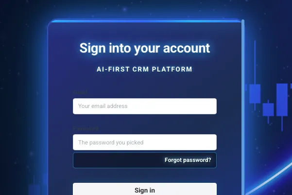
This is a comprehensive custom CSS solution that transforms the standard GoHighLevel/HighLevel login page into a stunning, modern interface for 1stContact.ai - an AI-First CRM platform. The design creates a futuristic, professional login experience that perfectly represents the cutting-edge nature of AI-powered customer relationship management.
✨ Key Features
Visual Design
Custom background image with full viewport coverage (no white bars)
Dark blue gradient login box with intense bright blue glow effects
Glassmorphism design with backdrop blur and translucent elements
Animated elements including pulsing header lines and floating orbs
High-contrast white text with blue glow shadows for perfect readability
Brand Integration
Custom 1stContact.ai logo positioned prominently above the login form
Brand color scheme using cobalt blue, navy blue, electric blue, and bright white
AI-themed visual elements that reinforce the "AI-First CRM Platform" messaging
User Experience
Smooth animations and hover effects for enhanced interactivity
Mobile-responsive design that works across all devices
High readability with contrasted text and background elements
Professional form styling with enhanced focus states and visual feedback
🛠 Technical Learnings
HighLevel/GoHighLevel CSS Customization Challenges
Platform Override Requirements: HighLevel's built-in styles require
!importantdeclarations and specific selectors to override effectivelyLogo Management: Platform generates automatic logos that need to be hidden when implementing custom branding
Viewport Coverage: Fixed positioning and careful margin management needed to prevent white space issues
Text Readability: Background images require strategic overlay techniques and high-contrast text styling
Advanced CSS Techniques Used
CSS Custom Properties (Variables) for maintainable color schemes
Backdrop-filter blur effects for modern glassmorphism
Multiple box-shadow layers for complex glow effects
CSS animations and keyframes for subtle motion design
Responsive design patterns with mobile-first approach
Z-index management for proper element layering
Problem-Solving Approach
Iterative design process - started with basic styling and enhanced based on feedback
Cross-browser compatibility considerations for backdrop-filter support
Mobile optimization with careful attention to iOS zoom prevention
Accessibility maintenance while achieving dramatic visual effects
🎨 Design Philosophy
The design balances professionalism with excitement - creating a login experience that:
Builds trust through clean, modern aesthetics
Generates excitement through dynamic visual effects
Reinforces brand identity through consistent color usage
Maintains usability through high contrast and clear hierarchy
📋 Implementation Notes
Best Practices Discovered
Test across devices - what looks great on desktop may need mobile adjustments
Prioritize readability - visual effects should never compromise text legibility
Use semantic naming - CSS variables make color scheme changes much easier
Plan for platform updates - use specific selectors that won't break with platform changes
Common Pitfalls Avoided
Viewport sizing issues - solved with fixed positioning and proper overflow management
Text contrast problems - addressed with multiple shadow layers and background overlays
Mobile responsiveness - handled with comprehensive media queries
Platform conflicts - managed through specificity and !important usage
🚀 Perfect For
This CSS solution is ideal for:
SaaS companies wanting to white-label HighLevel with custom branding
Agencies needing professional, branded client login experiences
Tech startups requiring modern, AI-themed visual identity
Any business using HighLevel who wants to stand out from generic templates
💡 Key Takeaway
Custom CSS for platform-based solutions like HighLevel requires a deep understanding of both the platform's structure and advanced CSS techniques. The most successful approach combines technical precision with creative vision, always prioritizing user experience while achieving dramatic visual impact.
This CSS demonstrates that with the right approach, even platform-based solutions can be transformed into unique, branded experiences that truly reflect a company's identity and values.
SAMPLE CSS - USE AT YOUR OWN RISK - MAKE SURE TO TEST
/* 1stContact.ai Custom Login Page CSS
===================================
Built for AI-First CRM Experience
Brand Colors: Light Blue #5dace5, Blue #2c5581, Dark Blue #041b4b,
Light Green #c1ff71, Green #7dd856, Dark Green #08bd62
*/
/* CSS Variables for 1stContact.ai Brand - Updated with Fun Colors */
:root {
/* Primary Brand Colors */
--primary-blue: #2c5581;
--primary-light-blue: #5dace5;
--primary-dark-blue: #041b4b;
--accent-green: #08bd62;
--accent-light-green: #7dd856;
--accent-neon-green: #c1ff71;
/* Fun Login Window Colors */
--cobalt-blue: #0047AB;
--navy-blue: #1e3a8a;
--bright-white: #ffffff;
--electric-blue: #007FFF;
--royal-blue: #4169E1;
/* UI Colors */
--white: #ffffff;
--glass-white: rgba(255, 255, 255, 0.95);
--glass-blue: rgba(0, 71, 171, 0.1);
--shadow-primary: rgba(0, 71, 171, 0.25);
--shadow-glow: rgba(0, 127, 255, 0.4);
--shadow-neon: rgba(65, 105, 225, 0.6);
/* Login specific variables */
--loginBtnColor: var(--cobalt-blue);
--loginBtnHover: var(--electric-blue);
--bodyBgColor: var(--bright-white);
--login-button-background-color: var(--cobalt-blue);
--login-button-background-hover-color: var(--royal-blue);
--login-button-text-color: var(--bright-white);
--input-focus-color: var(--electric-blue);
}
/* Enhanced Background with custom 1stContact.ai image - Fixed sizing */
.hl_login {
background-image: url("https://storage.googleapis.com/msgsndr/ZxV6a5v2dtZF5cAAOedY/media/687669a91acd8f6b2af2010e.png") !important;
background-position: center center;
background-size: cover;
background-repeat: no-repeat;
background-attachment: scroll;
/* Add subtle overlay to enhance readability and brand colors */
background-blend-mode: overlay;
background-color: rgba(4, 27, 75, 0.2);
/* Additional gradient overlay for depth */
position: fixed;
top: 0;
left: 0;
right: 0;
bottom: 0;
display: flex !important;
flex-direction: column !important;
justify-content: flex-start !important; /* Changed from center to flex-start */
align-items: center !important;
margin: 0 !important;
padding: 20px !important;
padding-top: 40px !important; /* Add top padding */
padding-bottom: 40px !important; /* Add bottom padding */
height: 100vh;
min-height: 100vh;
width: 100vw;
overflow-y: auto !important; /* Allow vertical scrolling */
box-sizing: border-box;
}
/* Additional fallback for full coverage and hide platform logo */
html, body {
margin: 0 !important;
padding: 0 !important;
height: 100% !important;
overflow-x: hidden !important;
}
/* Hide the platform's built-in green logo */
.hl_login--header img,
.hl_login--header .logo,
.hl_login--header .navbar-brand,
.hl_login--header > *:not(.hl_login--header::before) {
display: none !important;
}
/* Add a subtle brand color overlay */
.hl_login::before {
content: '';
position: absolute;
top: 0;
left: 0;
width: 100%;
height: 100%;
background: linear-gradient(135deg,
rgba(4, 27, 75, 0.15) 0%,
rgba(44, 85, 129, 0.1) 35%,
rgba(93, 172, 229, 0.08) 70%,
rgba(8, 189, 98, 0.1) 100%);
pointer-events: none;
z-index: 1;
}
/* Remove the old background animation and floating particles */
.hl_login--body {
position: relative;
z-index: 2;
}
/* Header styling - Force hide green logo and ensure blue logo shows */
.hl_login--header {
background: transparent !important;
border-bottom: 0 !important;
padding: 0 !important;
margin-bottom: 30px !important;
text-align: center;
position: relative;
z-index: 2;
height: 160px !important; /* Ensure space for larger logo */
}
/* Force hide any existing logo elements */
.hl_login--header * {
display: none !important;
}
/* Add 1stContact.ai logo area - FORCED 30% increase */
.hl_login--header::before {
content: '' !important;
display: block !important;
width: 260px !important; /* 30% larger than 200px */
height: 130px !important; /* 30% larger than 100px */
margin: 0 auto 30px !important;
background-image: url('https://images.leadconnectorhq.com/image/f_webp/q_80/r_1200/u_https://assets.cdn.filesafe.space/ZxV6a5v2dtZF5cAAOedY/media/686b0391bf950608e6fb14c0.png') !important;
background-size: contain !important;
background-repeat: no-repeat !important;
background-position: center !important;
filter: drop-shadow(0 6px 12px rgba(255, 255, 255, 0.4)) !important;
position: relative !important;
z-index: 10 !important;
}
/* Enhanced login body with dark blue background and bright blue glow - Fixed height */
div.hl_login--body {
max-width: 480px !important;
width: 100% !important;
max-height: 80vh !important; /* Prevent cutting off */
overflow-y: auto !important; /* Allow scrolling if needed */
background: linear-gradient(145deg,
var(--navy-blue) 0%,
#1a365d 50%,
var(--cobalt-blue) 100%) !important;
backdrop-filter: blur(25px) !important;
-webkit-backdrop-filter: blur(25px) !important;
border: 3px solid rgba(0, 127, 255, 0.6) !important;
border-radius: 25px !important;
box-shadow:
0 0 60px rgba(0, 127, 255, 0.8),
0 0 120px rgba(0, 191, 255, 0.4),
0 25px 50px rgba(0, 71, 171, 0.3),
inset 0 2px 4px rgba(255, 255, 255, 0.1),
inset 0 -2px 4px rgba(0, 0, 0, 0.2) !important;
position: relative;
z-index: 2;
margin: 20px auto !important;
/* Fun hover animation */
transition: all 0.4s cubic-bezier(0.175, 0.885, 0.32, 1.275);
transform-style: preserve-3d;
}
.hl_login--body:hover {
transform: translateY(-8px) scale(1.02);
box-shadow:
0 0 80px rgba(0, 127, 255, 1),
0 0 160px rgba(0, 191, 255, 0.6),
0 0 240px rgba(30, 144, 255, 0.3),
0 35px 70px rgba(0, 71, 171, 0.4),
inset 0 2px 4px rgba(255, 255, 255, 0.15),
inset 0 -2px 4px rgba(0, 0, 0, 0.3) !important;
border-color: rgba(0, 191, 255, 0.8) !important;
}
/* Intense bright blue glow accent line */
.hl_login--body::before {
content: '';
position: absolute;
top: 0;
left: 0;
right: 0;
height: 6px;
background: linear-gradient(90deg,
#00BFFF 0%,
#1E90FF 25%,
#0080FF 50%,
#00BFFF 75%,
#1E90FF 100%);
border-radius: 25px 25px 0 0;
animation: intensePulse 3s ease-in-out infinite;
box-shadow: 0 0 20px rgba(0, 191, 255, 0.8);
}
/* Bright blue orb floating effect */
.hl_login--body::after {
content: '';
position: absolute;
bottom: -30px;
right: -30px;
width: 150px;
height: 150px;
background: radial-gradient(circle,
rgba(0, 191, 255, 0.3) 0%,
rgba(30, 144, 255, 0.2) 40%,
rgba(0, 127, 255, 0.1) 70%,
transparent 100%);
border-radius: 50%;
animation: orbFloat 8s ease-in-out infinite;
box-shadow: 0 0 40px rgba(0, 191, 255, 0.4);
}
@keyframes intensePulse {
0%, 100% {
opacity: 0.8;
box-shadow: 0 0 20px rgba(0, 191, 255, 0.8);
background: linear-gradient(90deg,
#00BFFF 0%,
#1E90FF 25%,
#0080FF 50%,
#00BFFF 75%,
#1E90FF 100%);
}
50% {
opacity: 1;
box-shadow: 0 0 40px rgba(0, 191, 255, 1);
background: linear-gradient(90deg,
#1E90FF 0%,
#00BFFF 25%,
#0080FF 50%,
#1E90FF 75%,
#00BFFF 100%);
}
}
@keyframes orbFloat {
0%, 100% {
transform: translateY(0px) scale(1);
opacity: 0.6;
}
33% {
transform: translateY(-20px) scale(1.1);
opacity: 0.8;
}
66% {
transform: translateY(-10px) scale(0.9);
opacity: 0.7;
}
}
/* Card styling */
.hl_login--body .card {
width: 100% !important;
max-width: 100% !important;
margin: 0 auto !important;
box-shadow: none !important;
padding: 0 !important;
margin: 0 !important;
background: transparent !important;
border: none !important;
}
.hl_login--body .card .card-body {
max-width: 100% !important;
width: 100% !important;
margin: 0 auto;
padding: 50px 40px;
background: transparent;
}
/* Enhanced form styling with white text on dark background */
.hl_login .form-control {
background: rgba(255, 255, 255, 0.1) !important;
font-size: 16px !important;
color: var(--bright-white) !important;
border: 2px solid rgba(0, 191, 255, 0.5) !important;
border-radius: 15px !important;
padding: 18px 25px !important;
transition: all 0.4s cubic-bezier(0.25, 0.46, 0.45, 0.94) !important;
box-shadow:
inset 0 2px 6px rgba(0, 0, 0, 0.3),
0 2px 8px rgba(0, 191, 255, 0.2),
0 0 15px rgba(0, 127, 255, 0.1);
font-weight: 500;
position: relative;
backdrop-filter: blur(10px);
}
.hl_login .form-control:focus {
background: rgba(255, 255, 255, 0.15) !important;
border-color: #00BFFF !important;
box-shadow:
inset 0 2px 6px rgba(0, 0, 0, 0.2),
0 0 0 4px rgba(0, 191, 255, 0.3),
0 0 25px rgba(0, 191, 255, 0.6),
0 4px 12px rgba(30, 144, 255, 0.4) !important;
outline: none !important;
transform: translateY(-3px) scale(1.02);
color: var(--bright-white) !important;
}
.hl_login .form-control::placeholder {
color: rgba(255, 255, 255, 0.6) !important;
font-weight: 400;
transition: all 0.3s ease;
}
.hl_login .form-control:focus::placeholder {
color: rgba(255, 255, 255, 0.8) !important;
transform: translateY(-2px);
}
/* Enhanced headers with white text */
.hl_login--body .login-card-heading {
margin-bottom: 35px;
text-align: center;
position: relative;
}
.hl_login--body .heading2 {
margin-bottom: 20px;
font-size: 32px;
font-weight: 800;
color: var(--bright-white) !important;
text-shadow:
0 0 10px rgba(0, 191, 255, 0.8),
0 4px 8px rgba(0, 0, 0, 0.5),
0 0 20px rgba(0, 127, 255, 0.6);
letter-spacing: -0.5px;
animation: titleGlow 3s ease-in-out infinite;
}
@keyframes titleGlow {
0%, 100% {
text-shadow:
0 0 10px rgba(0, 191, 255, 0.8),
0 4px 8px rgba(0, 0, 0, 0.5),
0 0 20px rgba(0, 127, 255, 0.6);
transform: scale(1);
}
50% {
text-shadow:
0 0 20px rgba(0, 191, 255, 1),
0 4px 8px rgba(0, 0, 0, 0.5),
0 0 30px rgba(30, 144, 255, 0.8);
transform: scale(1.02);
}
}
/* White glowing AI tagline */
.hl_login--body .login-card-heading::after {
content: 'AI-First CRM Platform';
display: block;
font-size: 16px;
color: var(--bright-white) !important;
font-weight: 700;
letter-spacing: 2px;
text-transform: uppercase;
margin-top: 12px;
text-shadow:
0 0 8px rgba(0, 191, 255, 0.8),
0 2px 4px rgba(0, 0, 0, 0.3);
animation: taglineFloat 4s ease-in-out infinite;
}
@keyframes taglineFloat {
0%, 100% {
transform: translateY(0px);
text-shadow:
0 0 8px rgba(0, 191, 255, 0.8),
0 2px 4px rgba(0, 0, 0, 0.3);
}
50% {
transform: translateY(-3px);
text-shadow:
0 0 12px rgba(0, 191, 255, 1),
0 2px 4px rgba(0, 0, 0, 0.3);
}
}
/* Super exciting primary button */
.hl_login .button-holder.form-group {
margin: 35px auto 25px !important;
}
.hl_login .btn.btn-blue,
.hl_login .btn.btn-blue:active,
.hl_login .btn.btn-blue:focus {
background: linear-gradient(135deg,
var(--cobalt-blue) 0%,
var(--electric-blue) 50%,
var(--royal-blue) 100%) !important;
border: none !important;
color: var(--bright-white) !important;
font-weight: 700 !important;
font-size: 18px !important;
padding: 18px 40px !important;
border-radius: 18px !important;
transition: all 0.4s cubic-bezier(0.175, 0.885, 0.32, 1.275) !important;
box-shadow:
0 8px 25px rgba(0, 71, 171, 0.4),
0 4px 12px rgba(0, 127, 255, 0.3),
inset 0 2px 4px rgba(255, 255, 255, 0.2) !important;
position: relative;
overflow: hidden;
min-height: 60px;
letter-spacing: 1px;
text-transform: uppercase;
text-shadow: 0 2px 4px rgba(0, 0, 0, 0.2);
}
.hl_login .btn.btn-blue:hover {
background: linear-gradient(135deg,
var(--electric-blue) 0%,
var(--royal-blue) 50%,
var(--navy-blue) 100%) !important;
transform: translateY(-4px) scale(1.05) !important;
box-shadow:
0 12px 35px rgba(0, 71, 171, 0.5),
0 8px 20px rgba(0, 127, 255, 0.4),
0 4px 15px rgba(65, 105, 225, 0.3),
inset 0 2px 4px rgba(255, 255, 255, 0.3) !important;
}
/* Super exciting button glow effect */
.hl_login .btn.btn-blue::before {
content: '';
position: absolute;
top: 0;
left: -100%;
width: 100%;
height: 100%;
background: linear-gradient(90deg,
transparent,
rgba(255, 255, 255, 0.4),
transparent);
transition: left 0.6s cubic-bezier(0.25, 0.46, 0.45, 0.94);
border-radius: 18px;
}
.hl_login .btn.btn-blue:hover::before {
left: 100%;
}
/* Pulsing effect for extra excitement */
.hl_login .btn.btn-blue::after {
content: '';
position: absolute;
top: 50%;
left: 50%;
width: 0;
height: 0;
background: rgba(255, 255, 255, 0.1);
border-radius: 50%;
transform: translate(-50%, -50%);
transition: all 0.4s ease;
}
.hl_login .btn.btn-blue:active::after {
width: 300px;
height: 300px;
}
/* Form labels with bright white text and strong contrast */
.hl_login label {
color: #FFFFFF !important;
font-weight: 800 !important;
font-size: 16px !important;
margin-bottom: 12px !important;
text-transform: uppercase;
letter-spacing: 1.2px;
text-shadow:
2px 2px 4px rgba(0, 0, 0, 0.8),
0 0 8px rgba(0, 191, 255, 0.8),
0 0 15px rgba(255, 255, 255, 0.3);
display: block;
background: rgba(0, 0, 0, 0.3);
padding: 5px 10px;
border-radius: 5px;
backdrop-filter: blur(5px);
}
/* Links styling with high contrast white text */
.hl_login a {
color: #FFFFFF !important;
text-decoration: none !important;
font-weight: 700 !important;
font-size: 14px !important;
transition: all 0.3s cubic-bezier(0.25, 0.46, 0.45, 0.94) !important;
position: relative;
text-shadow:
2px 2px 4px rgba(0, 0, 0, 0.9),
0 0 8px rgba(0, 191, 255, 0.8),
0 0 15px rgba(255, 255, 255, 0.4);
background: rgba(0, 0, 0, 0.4);
padding: 8px 12px;
border-radius: 6px;
border: 1px solid rgba(0, 191, 255, 0.5);
backdrop-filter: blur(10px);
display: inline-block;
}
.hl_login a::before {
content: '';
position: absolute;
bottom: -2px;
left: 0;
width: 0;
height: 2px;
background: linear-gradient(90deg, #00BFFF, #1E90FF);
transition: width 0.3s ease;
box-shadow: 0 0 5px rgba(0, 191, 255, 0.8);
}
.hl_login a:hover {
color: #FFFFFF !important;
text-shadow:
2px 2px 4px rgba(0, 0, 0, 1),
0 0 12px rgba(0, 191, 255, 1),
0 0 25px rgba(30, 144, 255, 0.8) !important;
transform: translateY(-1px);
background: rgba(0, 0, 0, 0.6);
border-color: rgba(0, 191, 255, 0.8);
}
.hl_login a:hover::before {
width: 100%;
}
/* Remember me checkbox with high contrast styling */
.hl_login .form-check-input {
background-color: rgba(0, 0, 0, 0.3) !important;
border: 3px solid #FFFFFF !important;
border-radius: 6px !important;
width: 22px !important;
height: 22px !important;
transition: all 0.3s cubic-bezier(0.25, 0.46, 0.45, 0.94) !important;
backdrop-filter: blur(10px);
box-shadow:
0 0 10px rgba(0, 191, 255, 0.5),
inset 0 1px 2px rgba(255, 255, 255, 0.2);
}
.hl_login .form-check-input:checked {
background: linear-gradient(135deg, #00BFFF, #1E90FF) !important;
border-color: #FFFFFF !important;
box-shadow:
0 0 20px rgba(0, 191, 255, 1),
inset 0 1px 2px rgba(255, 255, 255, 0.4) !important;
transform: scale(1.1);
}
.hl_login .form-check-input:focus {
box-shadow: 0 0 0 4px rgba(255, 255, 255, 0.3) !important;
}
.hl_login .form-check-label {
color: #FFFFFF !important;
font-weight: 700 !important;
font-size: 14px !important;
margin-left: 10px !important;
text-shadow:
2px 2px 4px rgba(0, 0, 0, 0.8),
0 0 8px rgba(0, 191, 255, 0.6);
background: rgba(0, 0, 0, 0.3);
padding: 4px 8px;
border-radius: 4px;
backdrop-filter: blur(5px);
}
/* Google Sign-In button with high contrast text */
.hl_login .btn:not(.btn-blue),
.hl_login button:not(.btn-blue) {
background: rgba(255, 255, 255, 0.95) !important;
color: #333333 !important;
border: 2px solid #FFFFFF !important;
font-weight: 700 !important;
font-size: 16px !important;
text-shadow: none !important;
box-shadow:
0 4px 12px rgba(0, 0, 0, 0.3),
0 0 15px rgba(0, 191, 255, 0.3);
transition: all 0.3s ease !important;
}
.hl_login .btn:not(.btn-blue):hover,
.hl_login button:not(.btn-blue):hover {
background: #FFFFFF !important;
color: #222222 !important;
transform: translateY(-2px);
box-shadow:
0 6px 18px rgba(0, 0, 0, 0.4),
0 0 20px rgba(0, 191, 255, 0.5);
}
/* Terms and conditions text with high contrast */
.hl_login .text-muted,
.hl_login .small,
.hl_login small,
.hl_login p {
color: #FFFFFF !important;
font-weight: 600 !important;
font-size: 13px !important;
text-shadow:
2px 2px 4px rgba(0, 0, 0, 0.9),
0 0 8px rgba(0, 191, 255, 0.7),
0 0 15px rgba(255, 255, 255, 0.3);
background: rgba(0, 0, 0, 0.4) !important;
padding: 8px 12px !important;
border-radius: 6px !important;
border: 1px solid rgba(0, 191, 255, 0.4) !important;
backdrop-filter: blur(10px) !important;
margin: 10px 0 !important;
}
/* Error and alert messages */
.hl_login .alert,
.hl_login .text-danger {
background: rgba(220, 53, 69, 0.9) !important;
color: #FFFFFF !important;
border: 2px solid #FFFFFF !important;
font-weight: 700 !important;
text-shadow: 2px 2px 4px rgba(0, 0, 0, 0.8) !important;
}
/* Responsive design - Enhanced for full coverage */
@media (max-width: 768px) {
.hl_login {
padding: 10px !important;
height: 100vh !important;
position: fixed !important;
top: 0 !important;
left: 0 !important;
right: 0 !important;
bottom: 0 !important;
}
div.hl_login--body {
max-width: 95% !important;
margin: 0 auto !important;
}
.hl_login--body .card .card-body {
padding: 30px 25px;
}
.hl_login--body .heading2 {
font-size: 24px;
}
}
@media (max-width: 480px) {
.hl_login {
padding: 5px !important;
position: fixed !important;
top: 0 !important;
left: 0 !important;
right: 0 !important;
bottom: 0 !important;
}
.hl_login--body .card .card-body {
padding: 25px 20px;
}
.hl_login .form-control {
padding: 12px 15px !important;
font-size: 16px !important; /* Prevents zoom on iOS */
}
.hl_login .btn.btn-blue {
padding: 12px 25px !important;
font-size: 15px !important;
}
}
/* Additional fix for very large screens */
@media (min-height: 1200px) {
.hl_login {
height: 100vh !important;
position: fixed !important;
top: 0 !important;
left: 0 !important;
right: 0 !important;
bottom: 0 !important;
}
}
/* Simplified floating animation using the background image */
@keyframes float {
0%, 100% {
transform: translateY(0px);
opacity: 0.9;
}
50% {
transform: translateY(-10px);
opacity: 1;
}
}
/* Additional hover effects for form elements */
.hl_login .form-group {
position: relative;
margin-bottom: 25px;
}
.hl_login .form-group:hover .form-control {
border-color: rgba(93, 172, 229, 0.5) !important;
}
/* Custom scrollbar for any overflow content */
.hl_login ::-webkit-scrollbar {
width: 8px;
}
.hl_login ::-webkit-scrollbar-track {
background: rgba(255, 255, 255, 0.1);
border-radius: 4px;
}
.hl_login ::-webkit-scrollbar-thumb {
background: var(--primary-light-blue);
border-radius: 4px;
}
.hl_login ::-webkit-scrollbar-thumb:hover {
background: var(--primary-blue);
}
